INT 4843 Statistical Quality Assurance
INTERPRETATION OF X-Bar and R CHARTS
I. Out of Control Limits Shows Lack of Control for the Process
Control charts can indicate problems with the process when assignable causes exist in the system. The process with assignable causes is said "out-of-control". In this case, some data points for the control charts will be out of the control limits. In other words, if any measurement or test data is outside the control limits, we will know that something wrong exists in the process. Definitely, it is the time to take corrective actions.
II. Variation Pattern on the Control Charts Indicates Problems in the ProcessA control chart can indicate an out-of-control condition even though no single point plots outside the control limits, if the pattern of the plotted points exhibits non-random or systematic behavior. In many cases, the pattern of the plotted points on control charts will provide useful diagnostic information on the process, and this information can be used to make process modifications that reduce variability. In order to make full use of the information, the problem solving team should have expertise in both statistical principles of the control charts and the process.
A general guideline needs attention before interpreting the control charts. In interpreting patterns on the X chart, we must first determine whether or not the R chart is in control. Some assignable causes show up on both X and R charts. If both the X and R charts exhibit a non-random pattern, the best strategy is to eliminate the R chart assignable causes first. After the variation in the process has been reduced, it will be easier to adjust the process zero-setting. In many cases, this will automatically eliminate the non-random pattern on the X chart. Never attempt to interpret the X chart when the R chart indicates an out-of-control condition. We will now discuss several variation patterns often seen in the field and possible causes for these patterns.a. Cyclic Pattern
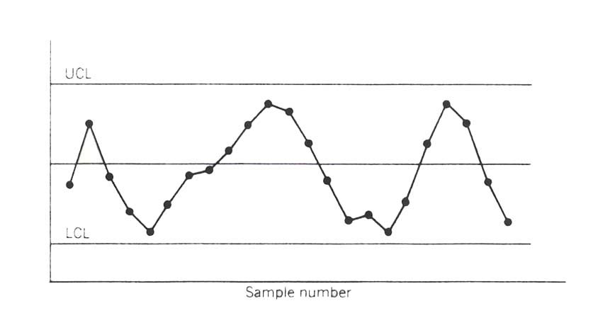
Cyclic pattern occasionally appears on the control charts. A typical pattern is shown in Figure 1. Such a pattern on the X chart may result from systematic environmental changes such as temperature, operator fatigue, regular rotation of operators and/or machine, or fluctuation in voltage or pressure or some other variable in the production equipment. R chart will sometimes reveal cycles because of maintenance schedule, operator fatigue, tool wear resulting in excessive variability.
Figure 2.
When cyclic pattern occurs, it is important to determine the cycle interval and time. This cyclic information will usually provide clues as for what may be the causes for the cyclic change.
b. Shift in Process Level:
A shift in process level is illustrated in Figure 2. These shifts may result from the introduction of new workers, methods, raw materials, or machine, a change in the inspection method or standards, or change in either the skill, attentiveness, or motivation of the operators. Sometimes an improvement in the process performance is noted following introduction of a control chart program, simply because of motivational factors influencing the workers.
Figure 3. A shift in process levelc. Trend:
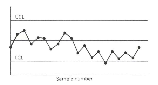
A trend, or continuous movement in one direction, is shown on the control chart in Figure 3. Trends are usually due to a gradual wearing out or deterioration of a tool or some other critical process components. They may be also caused by worker fatigue, accumulation of waste products, and deterioration of environmental conditions.
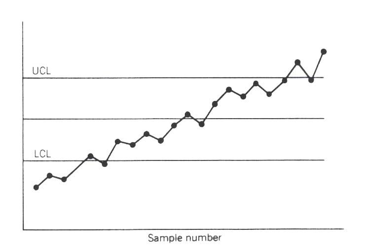
Figure 4. Trend in the process
d. Stratification or Lack of Variability:
Stratification, or a tendency for the points to cluster artificially around the center line, is shown in Figure 4. We noted that there is a marked lack of natural variability in the observed pattern. One potential cause of stratification is incorrect calculation of control limits. It may result from incorrect subgrouping. In collecting data for setting up R chart,
if the largest and smallest data in each sample are relatively far apart, average range R will be incorrectly inflated, causing the limits on the X chart to be too wide.
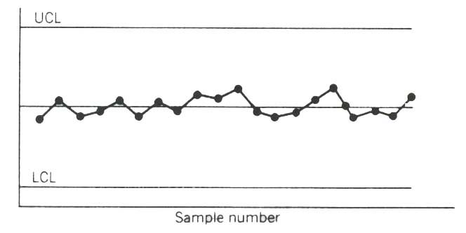
Figure 5. Stratification
Are you getting out of your Control Charts?
In today's competitive marketplace, many manufacturing firms must run production on two shifts with two different sets of tools to meet consumer demand and sustain profit. When developing a quality assurance system, these firms must make many basic decisions, such as determining sample size, sample frequency, type of statistical process control (SPC) chart to use. and what to do if the chart goes out of control. Another important question that managers must answer is whether or not the SPC subgroup data from the different tools should be combined on a single chart. Many managers might make this decision hastily; a poor decision, however, can lead to inefficient use of the sample data, resulting in increased quality problems.
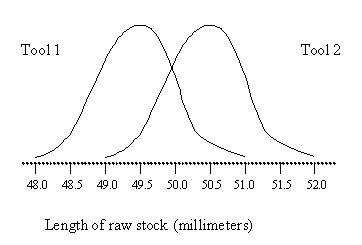
Figure 6 shows an example of a quality measurement from a process that uses two similar tools. The measurements used to evaluate the process indicate that the two tools are not operating at the same level. Suppose an X-bar chart for this process is developed by taking samples alternately from the two tools. If the usual out-of-con-trol signals are used, the chart is likely to give continual indication of the process being in control. There should be some method to help determine whether these two tools are operating differently. For managers in a quality setting, there has been no guidance on when to use a combined chart and when to use separate charts for each tool-until now.
The following guidelines can be used to help decide whether to use a combined control chart or separate control charts. Although the examples focus on the case of a two-tool environment, the rationale for decision making can be extended to two-shift operations. Throughout this discussion, it is assumed thai the subgroup samples taken will alternate between the two tools.
When selecting either a combined chart or separate charts, three factors must be considered: experience with the process or a similar process, the extensiveness of the signals used to indicate out-of-control processes, and management objectives with respect to the process being measured.
Experience
There is no substitute, statistical or otherwise, for firsthand knowledge of the process to be controlled. Therefore, experience with the process will have a great influence on which charting strategy is used. If the process is new and experience is nonexistent, a similar process should be examined and the following questions answered with this process in mind.
If a combined chart has been used in the past, does the X-bar or range chart exhibit a sawtooth pattern?
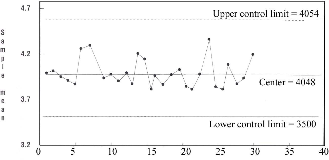
A sawtooth pattern is characterized by a consecutive series of alternately increasing and decreasing subgroup averages or ranges. Because it can be difficult to recognize a sawtooth pattern, it might take 30 or more subgroups before it is detected. Figure 7shows a sawtooth pattern in an X-bar chart of the margin between a fender and a door. The sawtooth pattern is sometimes called a mixture because measurements from two or more sources are mixed together on the chart.
Figure 6. Quality Measurement of a process Using Two Similar Tools
Note: Subgroups alternate between tools
Subgroups size = 5 Measurements in millimeters
Figure 7. X - Bar Chart for Fender-To-Door Margin (Tools 1 and 2 Combined)
The objective of a control chart is to maintain a stable process. If a sawtooth pattern is present, an investigation must be conducted to determine the cause. In Figure 7. the sawtooth pattern probably indicates a difference in the means of the two tools. The special causes might include differences in operator skill, differences in sampling techniques, differences in the tools themselves due to design or age. or a myriad of other possibilities.
Differences in areas such as operator skills and sampling techniques are usually easy to identify and correct. Some differences, however, might be quite difficult to isolate or very expensive to eliminate. If the sawtooth pattern cannot be eliminated, separate charts should be used for each tool.
If a combined chart was used in the past, do ihe X-bar and R charts yield frequent out-of-control signals?
If the combined X-bar and R charts exhibit frequent out-of-control signals, the special causes responsible for these signals should be identified and eliminated before proceeding. To estimate the frequency of out-of-control signals, obtain several months of charted data and carefully review the charts for such signals. Draw a circle around each of these out-of-control signals and count the number of subgroups between each circle. The average of these counts is an estimate of the frequency of out-of-control signals. This estimate provides an objective indication of process stability.
Since Walter A. Shewhart first introduced control charts in the 1920s, numerous rules have been proposed for interpreting control charts. Table 1 lists typical SPC rules for detecting out-of-control signals. The Automotive Industry Action Group, which recently published an SPC reference manual in conjunction with ASQC, suggests using rules 1. 2. 3. and 11.' Based on computer simulations of the operating characteristics of rules 1. 2, and 3, managers should look for an average run between out-of-control signals of at least 35 subgroups. The basis for this suggestion will be discussed in a later section.
If the average run between out-of-control signals is greater than or equal to 35 subgroups, the process is reasonably stable and the next question can be addressed. If the average run is less than 35, however, it can be concluded that the process is unstable and the causes for the lack of control should be identified and removed. If the average run is too short, it could be an indication that the true underlying causes of the out-of-control signals have not yet been identified and will continue to make the process unstable.
If the special causes cannot be eliminated, determine whether they affect both tools to approximately the same degree. If there is a difference, switch to separate charts for each tool. Further explanation for these suggestions will be discussed in a later section.
It might be useful to separate the underlying special causes of out-of-control signals into two categories: special causes that affect both tools and special causes that affect only one tool. If most of the special causes affect both tools to about the same degree, it is more efficient to use a combined chart. Conversely. if the special causes usually affect only one tool, separate charts are more appropriate.
Factors that tend to affect both tools equally can include problems with supplier quality, poor process design, ambient temperature, and so forth. Factors that tend to affect only one tool include differences in operator skill, sampling techniques and design or age of the tools.Table 1: Proposed Rules for Interpreting Control Charts (Out-Of-Control Signals)
1. Any point beyond the control limits.
2. Seven (or more) consecutive points above or below the centertine.
3. Seven consecutive increasing or decreasing points
4. Two out of three beyond two sigma on the same side of the centerline
5. Four out of five beyond one sigma on the same side of the centertine
6. Ten out of 11 consecutive points on the same side of the centertine
7. Twelve out of 14 consecutive points on the same side of the centerline
8. A series of points "hugging" the centerline
9. A series of points "hugging" the control limits
10. Fourteen consecutive points alternating up and down (sawtooth pattern)
11. Any nonrandom pattern (such as a cycle)
If separate charts have been used in the past, are the X-bar chart and R chart cemerlines for the two tools approximately the same value?If the answer to this question is yes, it is safe to assume that the data from the two tools are generated by the same process. There are two sample hypothesis tests that can answer this question with statistical validity; a reasonable judgment on the closeness of the center-lines, however, will often suffice. If there is a difference in the centerlines, continue to use separate charts until the cause of the difference can be eliminated.
If separate charts have been used in the past, do the X-bar and R charts for either tool yield frequent out-of-control signals?
This question is also asked if combined charting was used in the past. The guidance for subsequent action is the same: Identify and remove special causes if the average run between out-of-control signals is less than 35. If the special causes cannot be removed, determine whether their effect on both tools is approximately the same. If so, consider using a combined chart. If the special causes result in tool-to-tool differences, continue to use separate charts for each tool.
Extensiveness of signals used
Control charts are powerful process improvement tools because they allow users with little or no statistical training to perform statistically based diagnostic checks on the behavior of a process. Simple visual inspection of control charts can provide important information about the consistency of the process. When a control chart rule is violated, the process might be out of control. Generally speaking, the more rules used to interpret control charts, the faster the charts will detect or signal any out-of-control condition in the process. The use of multiple rules, however, also increases the probability of creating false alarms. For example, when control chart rules 1, 2. and 3 from Table I are used simultaneously, they will generate a false alarm, on average, about every 55 subgroups.
Many companies-have established formal action plans for responding to out-of-control signals, which include containment, inspection, and repair of suspect process output as well as investigations to determine the special causes of the out-of-control condition. In some cases, no special cause can be found. The investigation might fail because the special causes are intermittent and difficult to isolate. But the investigation might also fail simply because no special cause exists.
Management should understand that there is a trade-off between rapid detection of out-o["-control conditions and generation of-false alarms. Rapid detection of out-of-control signals reduces quality costs because it minimizes the quantity of product that must be contained, inspected, scrapped, or repaired. These potential savings are offset by the costs associated with the increased frequency of imestigations necessitated by false alarms. Discussion of the advantages and disadvantages of various combinations of SPC charting rules is beyond the scope of this article: however, if a combined chart is used for both shifts, the charts should be reviewed for nonrandom patterns. Nonrandom patterns include the sawtooth pattern discussed earlier and might also include repeating patterns, such as a cycle. These patterns should be treated as out-of-control signals. Analysis of the underlying causes of nonrandom patterns often yields a greater understanding of the process and reveals opportunities for process improvement.
Management objectives
Management must play a role in determining the optimal charting strategy. The crucial question in making the two-tool charting decision is: Which of the following strategies is preferred for detecting out-of-control conditions?
o Using charts that yield rapid detection of out-of-control factors affecting both tools (at the expense of a slower detection of factors that affect only one too!)
o Using charts that yield rapid detection of out-of-control factors affecting only one tool (at the expense of a slower detection of factors that affect both tools).
This question can best be understood by considering the advantages and disadvantages of the two charting strategies.
Combined charting has the advantage of rapid detection of factors that affect both tools. Assuming there is no difference between the tools, combined charts will detect points beyond the control limits as effectively as separate charts since the limits will be essentially the same. With respect to the run rules, however, the combined chart will signal an out-of'-control condition twice as fast as separate charts since there will be twice as many points charted. For example, separate charts would require a minimum of seven days to violate the seven-in-a-row ruie, assuming that one subgroup sample is taken per day. A corresponding combined chart will signal an out-of-control condition in 3.5 days.
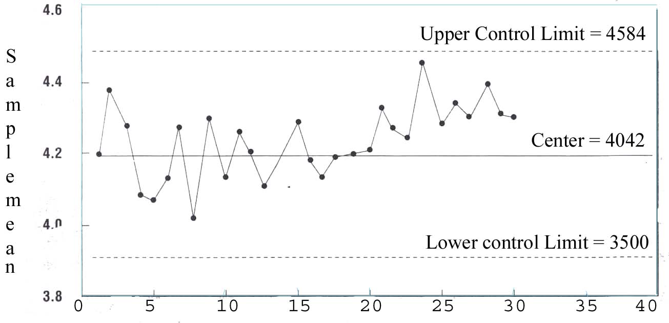
Sample number
Subgroup size = 5
Mesurements in millieters
Figure 8. X-Bar Chart for Fender-To-Door Margin (Tool1)
Sample number
Subgroup size = 5
Measurements in millimeters
Figure 9. X- Bar Chart for Fender-To-Door Margin (Tool 2)
Separate charts detect changes affecting only one tool better than a combined chart because a separate chart only plots data for that particular tool. These changes can include increases in the variation and trends or shifts in the mean. Trends are often signaled by the application of a runs rule, such as seven points in a row above or below the centerline or seven consecutively increasing or decreasing points. Changes might be caused by tool wear or damage, excessive tampering with the tool, or other factors.
A telltale run of seven plotted on a separate chart would probably not be detected on a combined chart if there is a tool-to-tool difference. In fact, the change that leads to the run on a separate chart will cause a sawtooth pattern on a combined chart. Figure 7 combines data from two tools in proper time sequence. Although a sawtooth pattern is present in the chart, there is no other indication that the process is out of control. In effect, the combined chart is masking an out-of-control condition that affects only one of the tools. When the data from Figure 7 were separated into two charts, it became clear that the sawtooth pattern was caused by a difference in the means of the two tools and a trend above the centerline in tool 2 (see Figures 8 and 9). Skill in detecting nonrandom patterns such as the sawtooth pattern is a key element in the success of the combined chart strategy.
In summary, a combined chart enables faster detection of special causes that affect both tools, and separate charts are better for detecting special causes that are unique to one tooi. Management objectives will be a major influence in determining which charting strategy to use.
If experience has shown that factors affecting both tools occur more frequently than factors affecting only one of the tools, then management might want to consider this when determining the charting strategy. On the other hand, management might have observed that factors affecting only one tool at a lime tend to cause more disruption to the system. In this case, separate charts will probably lead to faster detection of the problem.
Implementation
Kaoru Ishikawa said. "Quality control begins with education and ends with education.": Accordingly, the first and foremost requirement for selecting a charting strategy is training. The concepts outlined in this article can usually be adequately explained to competent users in less than an hour. Following the training, management should initiate a study of several key processes. Historical control charts should be reviewed and the causes for out-of-control signals tabulated. After the results have been reviewed, management can then state a preference for either rapid detection of special causes affecting both tools or rapid detection of special causes affecting only one tool.
An average run of 35 subgroups between out-of-control signals is adequate to assume that the process is reasonably stable. This criterion is based on the probability of generating false alarms using SPC rules 1. 2. and 3 from Table 1. Companies that use different rules or want to establish a more conservative decision criterion should consult a statistician to determine how many subgroups to use in assessing process stability. The bibliography at the end of this article lists several helpful references for those interested in modifying this criterion. The number should be set somewhere below the average false-alarm rate. This will help avoid unnecessary investigations of good processes.
This decision-making strategy can be extended to other applications. With a few minor modifications, these concepts could be applied to p charts and other types of SPC charts. Furthermore, this approach need not be limited to the multiple-tool charting question. Suppose two or more shifts are necessary to meet production requirements. Should each shift have its own chart, or should sample subgroups from each shift be included in a single, combined chart? Read this article a second time and mentally substitute the word "shift" for the word "tool" every time it appears. Although differences between shifts should not be tolerated, there might be certain circumstances in which these differences cannot be eliminated. Answering the questions in this article will provide guidance in determining the appropriate charting strategy.
This methodology was introduced to a large group of SPC practitioners. One member of the group raised an important question: "Why not skip all these questions and simply plot the data both ways [in separate and combined charts]? After all, the biggest expense is sampling, not plotting the data." There are two drawbacks to this suggestion. First, one charting method might signal that the process is out of control while the otherdoes not. This might lead to confusion about whether the process is truly out of control. Second, charting the data both ways will increase the number of false alarms. Each time a subgroup is plotted, there is a probability that it will generate a false alarm. Plotting each subgroup twice creates an extra opportunity to generate a false alarm. A reasonable alternative might be to plot the data using the preferred charting strategy while clearly identifying the source of each subgroup. When an out-of-control signal initiates an investigation, part of the diagnostic process could be to replot the subgroups, using the other charting strategy, to look for additional clues. This approach was demonstrated in Figures 7, 8, and 9.
Making the decision on which charting strategy to use, which has often been reserved for technical experts and consultants, can be accomplished by novices after a modest amount of training. Informed decisions will result in more efficient use of the sample data and lead to more effective quality improvement efforts.
School of Technology
College of Business & Applied Sciences
Eastern Illinois University
%20copy.jpg)