The Pareto analysis or Pareto chart is a bar graph that ranks problems in decreasing order of occurrence frequency. The concept was originated by Italian economist Vifredo Pareto. Its principle states that the comparative distribution of certain economic factors, such as wealth, follows an inverse relationship. Pareto discovered and theorized that 80 percent of the wealth in his country in the early 1900's was concentrated in 20 percent of the population.
The Pareto's concept was introduced to solve manufacturing quality problems by Dr. Joseph M. Juran. He discovered that the 80 percent - 20 percent split also occurs in manufacturing and quality problems. Eighty percent of the scrap is caused by 20 percent of the problems, and 80 percent of the dollar loss caused by poor quality is concentrated in 20 percent of the quality problems. Of course, in reality the 80 percent - 20 percent split is not exact; the percentages vary quite a bit. A more precise statement is that a few of manufacturing process characteristics (vital few) cause most of the problems on the line, whereas most process characteristics (trivial many) account for very little of the problems on manufacturing line. The important outcome of a Pareto chart is its assessment of process problem priorities. It separates the vital few problems from the trivial many. It is one of the most widely used and effective problem solving tools in manufacturing.
When a problem analysis is performed for a Pareto chart, data are gathered that give the number of occurrences for each problem and the dollar loss associated with it. When all the data have been collected, percentages can be tabulated for both the number data and the dollar loss data.
The procedure for making a Pareto chart is as follows:
1. Decide on the subject of the chart. Usually the need to set data priorities suggests the use of a Pareto analysis. Determine what data are to be collected.
-Where is the problem?
-What are the categories?
Where should the data be gathered?
-Should they come directly off a line?
-Should they come from a bin of nonconformities that have accumulated in the specified time period?
2. Be sure the time period for all the categories is the same: Use the number of nonconformities per hour, per shift, or per week.
3. What type of chart is needed? Should you tract the numbers in each category, the percent in each category, or the costs in each category? A cost chart is usually included with either a number chart of a percent chart.
4. Make a table by gathering the data and tallying the numbers in each category. Make a cost of nonconformities column and a cumulative percent column.
5. Arrange the table of data from the largest category to the smallest. List the category of others after the smallest for those causes that could not be identified.
6. Set the scale and draw a Pareto chart.
7. Include all pertinent information on the chart. Are the categories clear? Has the time frame been specified?
8. Analyze the chart. The largest bars represent the vital few. The cumulative percent line levels off and emphasizes the trivial many. If the chart does not show a vital few, check to see if it is possible to re-categorize for another analysis.-----------------------------------------------------------------------------------
EXAMPLE
An analysis of nonconforming shirts in a week's production revealed the following causes. The nonconforming shirts were discounted according to defect and sold to Bargain Bin Incorporated and
the dollar loss noted.
Solution
The data have been organized in the table according to the number of defects in each category. The percentages were calculated as follows:
1 . Add the values in the number of defective shirts column to get the total number of defects.
2. Divide each number of defects by the total from step 1 and multiply by 100 to get the percent of the total number of defects.
The percents of defective shirts with loose threads or hemming problems, for example, are calculated according to the two steps:
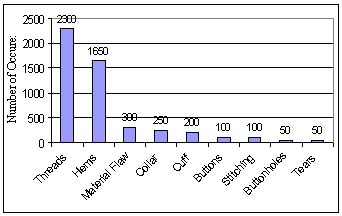
Loose threads: 2300/5000*100 = 46%
Hemming: 1650/5000*100 = 33%
The percents were totaled in the last column.
Pareto Charts:
46% Loose threads 79% = 46% + 33% Threads and hems 85% = 79% + 6%
Threads, hems, and flaws 90% = 85% + 5% Threads, hems, flaws, and collars
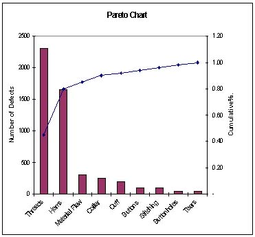
Theareto chart can be formed in a few different ways. Figure 1 shows the basic chart with the number of defective shirts on the vertical scale and the different categories on the horizontal scale. Figure 2 shows the dollar loss on the vertical axis and the categories as the charted values go from largest to smallest. Figure 3 is a combination of two Pareto charts. The left scale tracks the number of defects per category with the bar graph, and the right scale tracks the accumulated percent of all defects with a line graph. It is common practice to combine a cummulative percent chart with a percent of defects chart and also with a dollar loss chart.
In all cases, the culmulative percent line levels off at the trivial many.
Figure 1. A Preto chart for the example of the number of nonconforming shirts per week with the number of defects per category per week.
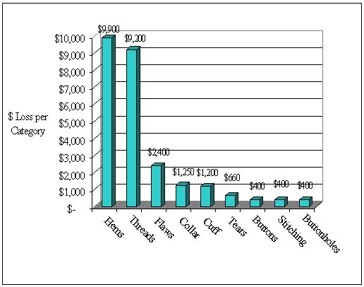
Figure 2. A Pareto chart for the example showing the dollar loss per category per week.
Figure 3. A Pareto chart for the example showing the number of defects and the cumulative percent.
WORKING EXAMPLE
The aerospace firm has identified the following defect categories for the tanks manufactured.
Parts damaged Machining problems Supplied parts rusted Masking insufficient Misaligned weld Processing out of order Wrong part issued Unfinished fairing Adhesive failure Powdery alodine Paint out of limits Paint damaged by etching Film on parts Primer cans damaged Voids in casting Delaminated composite Incorrect dimensions Improper test procedure Salt-spray failure 34
Perform Pareto analysis to identify the major causes for improving the product quality.
Harnessing the Power of the Pareto Principle
"A clinic used the Pareto diagram to improve its insurance billing process"
by
Marti BBfflJamin
and
James 6. Shaw
Like many other small and midsized businesses, San Jose Medical Group in California needed to upgrade its computer system to keep up with increasing computer needs. So, in the summer of 1990, new software and hardware were installed The system interfaced with many of the clinic's key administrative processes, such as patient scheduling, patient registration, charge entry, insurance claims submission, and collections.
In the months following the upgrade, the process of billing insurance companies for payment deteriorated rapidly. The seriousness of the situation emerged when, after 120 days on the new system, accounts receivable had climbed by almost $1 million. By the 180-day point, accounts receivable had more than doubled compared to the pre-upgrade level. Shortly after that, reduced cash flow began to threaten the clinic's existence.
Management had to act quickly to avert disaster. It already had a process improvement effort under way to resolve an unrelated, but equally critical, situation involving the movement of medical records between the main clinic and eight branch offices. A quality improvement team (QFT) was formed to solve the problem. Within 60 days, the medical records situation began to improve dramatically.1 Since the same techniques that improved the movement of medical records could also be applied to the deteriorating cash flow situation, management decided to form a second QFT.
The second QFT consisted of executives, middle managers, and One personnel. The team met for 90 minutes each week. Since the team members weren't proficient in applying quality improvement techniques, an outside quality improvement expert was retained to facilitate team meetings, provide statistical quality control support, perform analyses, and train team members as needed.
The problem
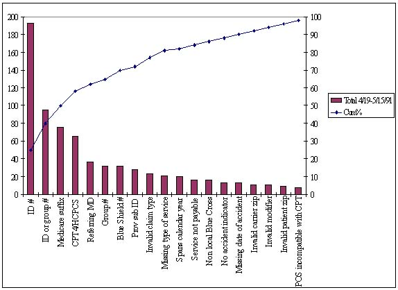
Prior to upgrading the computer system, an in-house data entry department scrutinized claims before sending mem to the insurance companies for payment. After the upgrade, the clinic contracted with a clearinghouse to perform this task. The clinic now sends its claims electronically to the clearinghouse, which validates each data field on the claims by applying tests to the data. The claims that pass the tests are forwarded to the appropriate insurance carrier for payment. The ones that fail are returned to the clinic within a day or two along with a note indicating why they were rejected. If the clinic were to submit an erroneous claim directly to an insurance carrier, three to four weeks would likely pass before the clinic would be notified of the error. By using the clearinghouse, the entire process of reworking errors is accelerated.Management believed however, that the clearinghouse was rejecting an abnormally high number of insurance claims. Therefore, the QIT's initial meeting focused on the reasons why payment claims were being rejected. A Pareto diagram was constructed showing the main reasons for payment rejections over a two-week period (see Figure I). The team concentrated on the "vital few" causes displayed to the left of the 80/20 line (i.e., the causes of 80% of the rejections) and concluded that the principal problem was incorrect patient insurance information (e.g., wrong policy number, wrong member number, or incorrect social security number). Since this information was entered during the patient registration process, the team's corrective action initially focused on improving the registration process.
Figure1. Initial Pareto Diagram of Reasons for payment Claim Rejections by the Clearinghouse
In hindsight, the registration process was an obvious starting point in the improvement effort. There are literally thousands of insurance companies, preferred provider organizations, and health maintenance organizations (payers). Each provides its members with identification cards displaying the insurance information in creative, nonstandard-ized formats. Given the wide variety of identification card formats, it is difficult for the person registering the patient to obtain the proper information. Therefore, the clinic had come to routinely expect registration errors.
Prior to converting to the new computer wct*m the clinic believed its claim rejection rate was about 4%. The new computer system, however, did not generate reports regarding the clearinghouse's claim rejection rate. Thus, the QIT had to estimate the current rejection rate by manually tallying several weeks' worth of claims. That exercise indicated that the clearinghouse rejection rate was about 20%. Assuming the rejection rate of the tallied claims was generally accurate for all claims submitted for payment, it meant the clinic was experiencing a fivefold increase in claim rejections compared to the pre-upgrade average.
The team members decided their initial goal should be to get the rejection rate back down to the pre-upgrade average of 4%. They also decided that the process should be continuously monitored to verify that each change made by the QIT resulted in an improvement. The QIT contemplated developing a run control chart to distinguish special cause variation from common cause variation, but the computer runs were too sporadic, and the necessary computer-generated data were not routinely available.3 (Sometimes certain key programs weren't run for a week or more because of the computer's slow processor speed and lack of disk space.) Rather than manually gathering the data, the team opted to continue using only the Pareto diagram coupled with an occasional manual calculation of the claim rejection rate. This approach meant revising the Pareto diagram before each meeting so that it reflected only the output errors related to the payment rejections received since the last meeting.
Since any one of more than 70 employees might enter patient information at any one of more than 100 different terminals, the QIT collected the payment rejections on a "by reason by location" basis. Location information was tracked only at the branch level because the computer software wasn't capable of cracking data entry information by user identification or terminal identification. A check sheet was manually constructed and completed to summarize each week's claim rejections. (Computer-generated reports showing such information were not readily available.) The total listing of rejections by reason was then displayed in a Pareto diagram at the team's weekly meeting. During the meeting, the team would brainstorm and prioritize the possible causes for the various rejections. Action items were developed, given due dates, and assigned to team members.
The stacked-bar Pareto diagram
At first, team members used only a single bar in the Pareto diagram. It wasn't long, however, before they wanted more information displayed. This was understandable because the basic Pareto diagram shows only one aspect of the data being tracked on the check sheet. Only a count of rejections by location or a count of rejections by reason could be shown—not both.Since the team members had quickly grasped how to interpret the Pareto diagram, the facilitator introduced them to the stacked-bar Pareto diagram. Whereas the basic Pareto diagram ranks only one factor, the stacked-bar Pareto diagram ranks two. The team readily grasped how to interpret this chart and found it much more useful than the single-bar version because it showed both the count of rejections by location and the count of rejections by reason.
The stacked-bar Pareto diagram became the primary tool for monitoring the process's performance. It was easy to construct using the available personal computer (PC) spreadsheet software. In fact, a macro was developed that allowed a clerk with no knowledge of spreadsheets to transfer the most recent check sheet counts to the PC spreadsheet and print the stacked-bar Farcco diagram prior to each QIT meeting.
Unintentionally, one stacked-bar Pareto diagram was printed in color. The team members reacted positively; they felt that the use of color made it much easier to understand the displayed data. Co-workers also seemed to like the colored chart better; they paid much more attention to it than they did the black-and-white ones that were previously hung in their work areas. From then on, the charts were always printed in color.
Improving the process
During the first few months of its existence, the team developed and implemented more than 100 action items. The initial action items focused on getting the new computer system to better validate the information at the time of data entry. Although the data were entered on-line, the new computer system wasn't able to check the data for much more than numeric or alphanumeric content. Instead of verifying the data in real time, the system depended on the clearinghouse to detect errors. Thus, no one in the clinic was notified of data errors until several days after data entry. By then the patient was gone, and it was not easy to correct the suspected information.The team felt that, ideally, the software should have provided data validation feedback at the time the patient was being registered. That way, if errors occur, they can be corrected while the patient (and the patient's insurance card) are at the terminal and still readily accessible. The fact that the new system didn't have this capability proved disappointing to the team members because it increased the difficulty of their task.
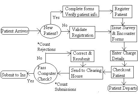
Once the team members accepted that the computer system could not be modified, they decided that the quickest way to improve was to make every user an expert in the system's limitations and possible circumventions. Therefore, the next phase of improvement action items was targeted at intensely training computer users. Early in this phase, the process was flow-charted as shown in Figure 3. A training nmcrmm for employees was then developed. The program was pilot tested in one location and then phased in at other locations. Revisions were common during the early stages, and the training manual quickly grew to more than 50 pages. This training program proved to be significantly better than the initial one provided by the software supplier.
Figure 3. Flowchart of the Clinic's claim for Payment Submission Process.
Verifying success
Team members were eager to see results, so each weekly meeting began with a review of the most recent stacked-bar Pareto diagram. The team brainstormed the main causes for the prior week's rejections and developed action assignments designed to prevent the problems' recurrence. The team also reviewed the status of each open action item at least every third meeting.Collecting data to prove conclusively that the process was improving was difficult since the computer software would intermix payment resubmissions with first-time submissions (see Figure 3). In addition, the computer system reports, when available, did not distinguish between rejections of the resubmissions and rejections of the first-time submissions. The team was able to satisfy itself that incorrect patient insurance information was no longer the leading reason for payment failure by manually screening the rejections based on date of service and by using the stacked-bar Pareto diagram.
By the 12th week, the team began focusing its attention on some of the original "useful many" causes of rejection (i.e., the causes that initially accounted for only 20% of the rejections). By this time, the useful many causes had moved up in the stacked-bar Pareto diagram because the other leading causes were eliminated or controlled.
A plot of the clearinghouse's total number of rejections during the first five months of the improvement effort showed a distinct downward trend (see Figure 4). In fact, the total errors per month had fallen by more than half of what they had been at the beginning of the improvement effort. Since this total count of rejections included payment claims that were being reprocessed a second or third time, the clinic's first-time error rate was presumed to be even lower.
Figure 4. Montly Trend in Total Payment Claim Rejections by the Clearinghouse, Including Rejections of Resubmissions.
The stacked-bar Pareto diagram produced for the QIT's 20th meeting, however, displayed a sudden reversion back to the original causes for rejection, but only within one branch. Investigation revealed that the source of the errors was a part-time employee who was on vacation when the training was conducted. A crash course for that person prevented the problems from recurring.
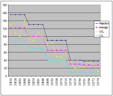
Throughout the improvement effort, an occasional manual calculation was performed to track the rejection rate. By the 22nd week, these calculations indicated that the rejection rate had indeed been reduced to 4%. The team members had achieved their goal. They did not, however, terminate their efforts. Instead, they set a new goal: reduce the rejection rate to 2% or less. As Figure 5 shows, the team eventually achieved that objective, and as a result, the clinic achieved its lowest-ever rejection rate.
Figure 5. Montly Trend in Payment Claim Rejections by Insurance Companies.
Pareto principle prevents disaster
Although the clinic's computer system upgrade almost meant disaster for the organization, the quality improvement team was able to turn the tables by using the stacked-bar Pareto diagram and other quality tools and techniques. Not only did the team reach its initial goal of getting the rejection rate back to the preupgrade status, it also reduced the rate to an all-time low.
-------------------------------------------------
References
1. James Shaw. "Making Quality Improvement Work." Group Practice Journal, January/February 1992, pp. 5-23.
2. Ronald D. Moen and Thomas W, Nolan. "Process Improvement" Quality Progress. September 1987, pp. 62-68.
3- Howard Gitlow, Shelly Gitlow, Alan Oppenheim, and Rosa Oppenheim. Tools and Methods for the Improvement of Quality (Boston, MA: Richard D. Irwin, Inc., 1989), pp. 460-462.
Marti Bemjamin was the director of marketing at San Jose Medical Group, Inc. in San Jose. CA. She currently is a manager of ambulatory care at Lucile Salter Packard Children's Hospital in Stanford, CA. She received a bachelor's degree In management from Marylhurst College in Marylhurst, OR.
James G. Shaw is the principal of Shaw Resources in Cupertino, CA. He received a master's degree in business administration from the University of California at Berkeley. Shaw is a member of ASQC-
© 1993 by Shaw Resources, Cupertino, CA. All rights reserved.
School of Technology
College of Business & Applied Sciences
Eastern Illinois University