For any process, it is important to know the variation pattern of the process in order to control and minimize the variations in the process. One of the ways to describe the process variation is to use tally chart and then configure a histogram.
Tally chart is a chart or a table that counts all the occurrences at each data value or each cell. The following table presents 125 observations on the inside diameter of forged piston rings used in an automobile engine. The data were collected in 25 samples of five observations each. Notice that there is some variability in piston ring diameter. However, it is very difficult to see any pattern in the variability or structure in the data in the table.
Table 1 Initial observations on the process
A tally chart is configured in this page in terms of the frequency of the data, i.e., the number of occurrences at each dimension cell, as in Table 2.
Table 2. Tally chart for the observations in Table 1
73.965 <= x <= 73.970 1 73.970 <= x <= 73.975 73.975 <= x <= 73.980 73.980 <= x <= 73.985 1111 111 73.985 <= x <= 73.990 1111 1111 73.990 <= x <= 73.995 1111 1111 1111 1111 73.995 <= x <= 74.000 1111 1111 1111 1111 111 77.000 <= x <= 74.005 1111 1111 1111 1111 11 74.005 <= x <= 74.010 1111 1111 1111 1111 11 74.010 <= x <= 74.015 1111 1111 111 74.015 <= x <= 74.020 1111 74.020 <= x <= 74.025 11 74.025 <= x <= 74.030 1 Total
A graph of the observed frequencies versus the piston ring diameter is shown in this page. This graph is called histogram. The tally chart and histogram present a visual display of the data in which one may more easily see three properties:
1. Shape of the distribution
2. Central tendency: the most probable value for the process
3. Dispersion or spread of the distribution.
Figure 1. Histogram of piston ring diameter
Application Example -- A use of tally chart to accomplish a cost saving:
Facts of the case:
In 100% inspection of completed electronic devices, a certain critical electrical characteristic was measured on a meter. This meter had a dial gage on which the value of the electrical characteristic was indicated by a pointer. Two fixed red lines were set on the dial, one at the maximum specified value and another at the minimum. This permitted the inspector to tell at a glance whether or not each device met the specifications, so that the inspector could rapidly sort the nonconforming product from the acceptable product.
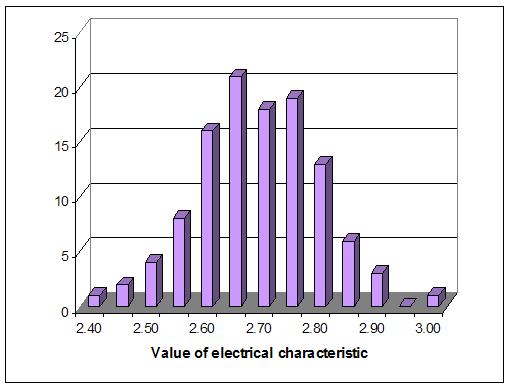
Because this characteristic was responsible for a number of rejections and it was desired to study its pattern of variation, the inspector was asked to read the value registered on the dial gage for every device and to make a line on a frequency distribution tally chart indicating this value. Based upon the tally, a distribution bar diagram was created for each shift and sent immediately to the quality control engineer of the plant. These bar diagrams generally looked like Figure 2.

Figure 2. Typical bar diagram showing frequency distribution of electrical characteristic of electronic device
One morning the distribution bar diagram for the preceding night shift looked like Figure 3 in the following page. This not only indicated a great increase in the proportion of nonconforming units but also showed an unusual distribution pattern. According to the tow tally charts, we could conclude that there is something wrong with the process.
Figure 3. This bar diagram called for investigation of the reasons for the unusual distribution pattern.
Analysis and action:
The quality control engineer, suspecting that this unusual distribution pattern might indicate an inspector error, went immediately to the inspection station and rescued from the scrap bin the devices rejected on the night shift. They were all retested by the day shift inspector, and nearly all proved to be satisfactory. It developed that there had been a new inspector on the night shift who had not understood how to operate the test equipment. Several hundred dollar worth of acceptable products were thus saved from the scrap heap. The new night shift inspector was instructed in the correct method of testing so that the mistake would not be repeated.
The following steps will be used to construct a tally chart and a histogram:
1. Count the number of observations (n).
2. Find the largest and smallest observations.
3. Find the range (the largest - the smallest).
4. Determine the number and width of the class intervals by the following rules:
a. Generally use from 4 to 20 cells.
b. Use class intervals of equal width. When choosing class intervals, be sure to choose values that leave no question of the interval in which a value falls.
c. As a rule of thumb, use for the number of class intervals.
d. Choose the lower limit for the first cell by using a value that is slightly less than the smallest data value.
d. The class interval h can be determined by h = range/ number of cells.
5. Tally the data for each cell determined in step 4 for a tally chart. The a histogram can be configured by drawing rectangular boxes with heights equal to the frequencies of the number of observations in each cell determined in step 4.
WORKING EXAMPLE
In a manufacturing production line that produces magnetic recording heads, a critical process parameter that is monitored to determine how the line is performing is gap width. In this process, 100 magnetic recording heads were examined to determine the gap width. The units of measurement of gap width are mm. The following table gives the results of this study.
Make a tally chart in the following format and then draw a histogram for the process distribution.
School of Technology
College of Business & Applied Sciences
Eastern Illinois University